Secondary Flow Redesign
2022 | UX Designer | Contract
Project Objective
The design team at Holland America Line needed to update their web presence. I had the pleasure of working with the team to update the secondary flow; the part of the site you see after you’ve booked and maybe want to schedule yourself a nice shore excursion.
My Role
Redesigning the UI
Transfer all Adobe XD assets to Figma
Conduct frequent competitive analysis
Helped to ensure the design passed WCAG 2.1 criteria
Assisted writing and conducting user interviews
Project Overview
Holland America Line has been working for the past few years to make sure that their website is easy to use, meets ADA and WCAG 2.1 standards, and has a modern feel to it.
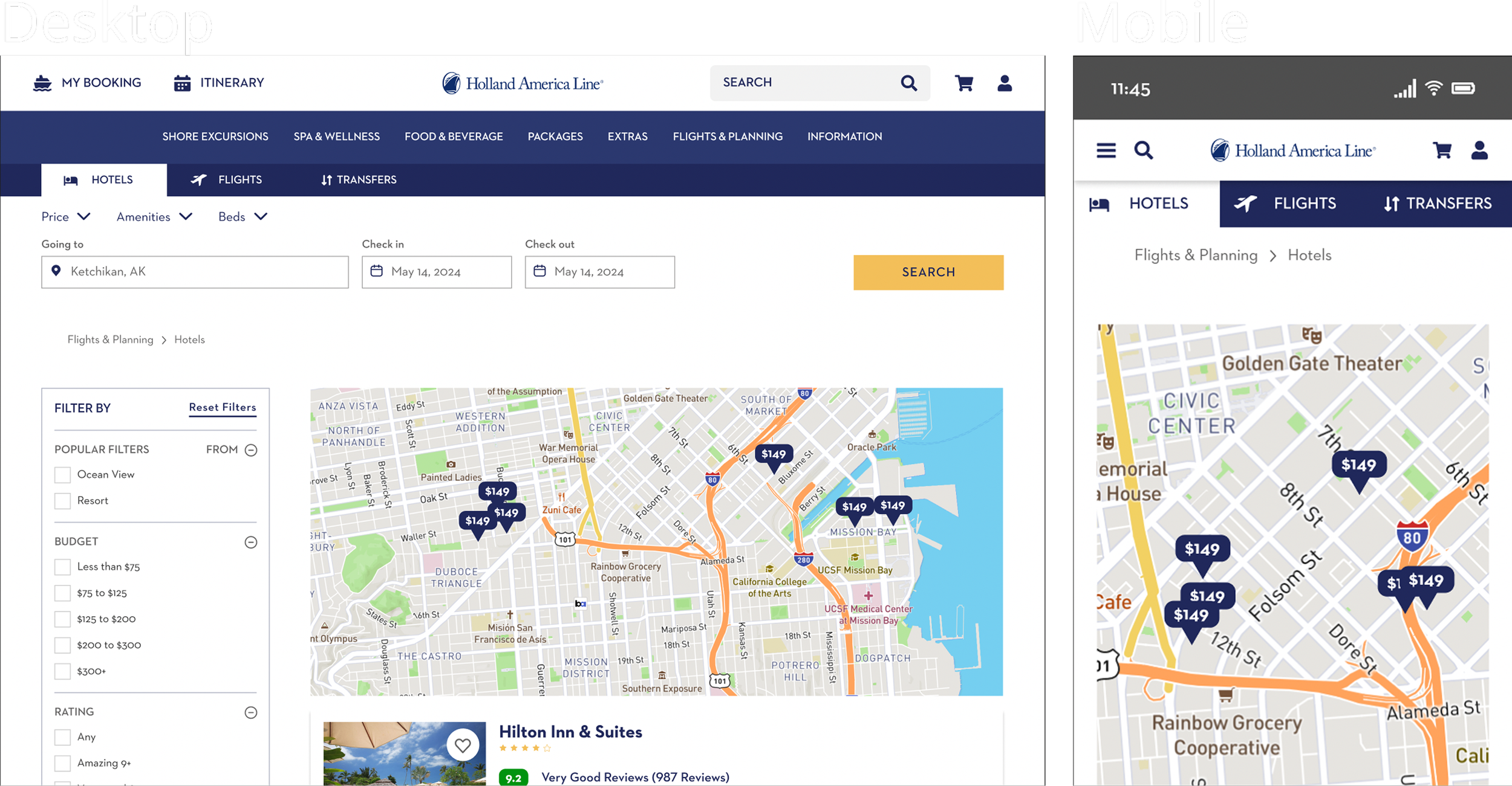
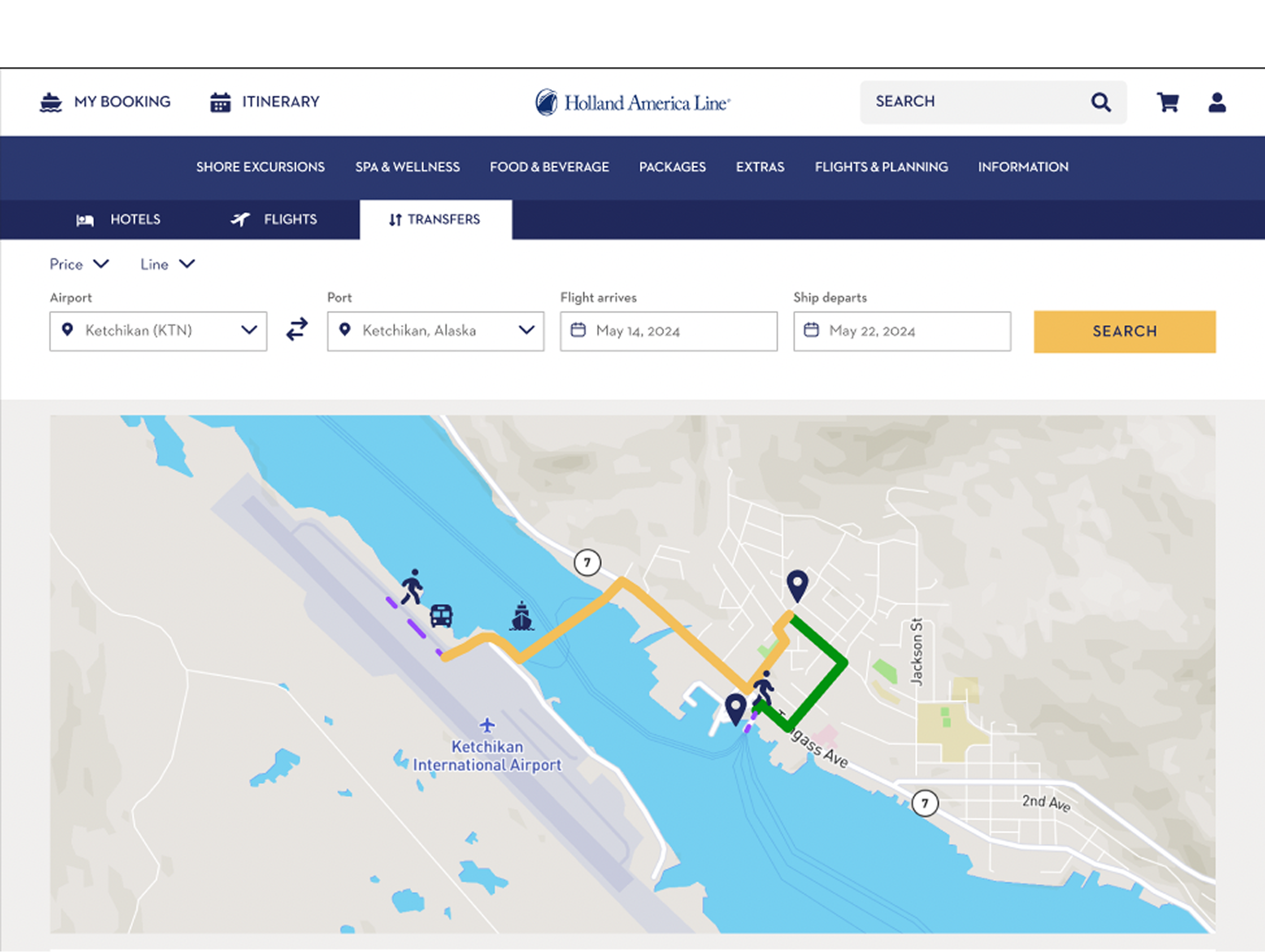
One of the first tasks on the table was moving the design file from Adobe XD to Figma. Once the designs had been transferred successfully, I set up the initial header prototype for all viewports (Web/Tablet/Mobile). After that was done, there were dozens of pages to update with the new design, and plenty of new pages to design from scratch including; Extras; Flights & Planning (Transfers, Flights, Hotels); Checkout cart.
I also assisted in a user testing session for the Shore Excursion pages.
Timeline
April 2022 - August 2022
User testing overview
This round of testing was designed to see how users responded to the redesigned Shore Excursion flow. Each of the three designers on the project performed a moderated usability test on two different individuals using a pre-written script as a guide.
Task 1
Prompts:
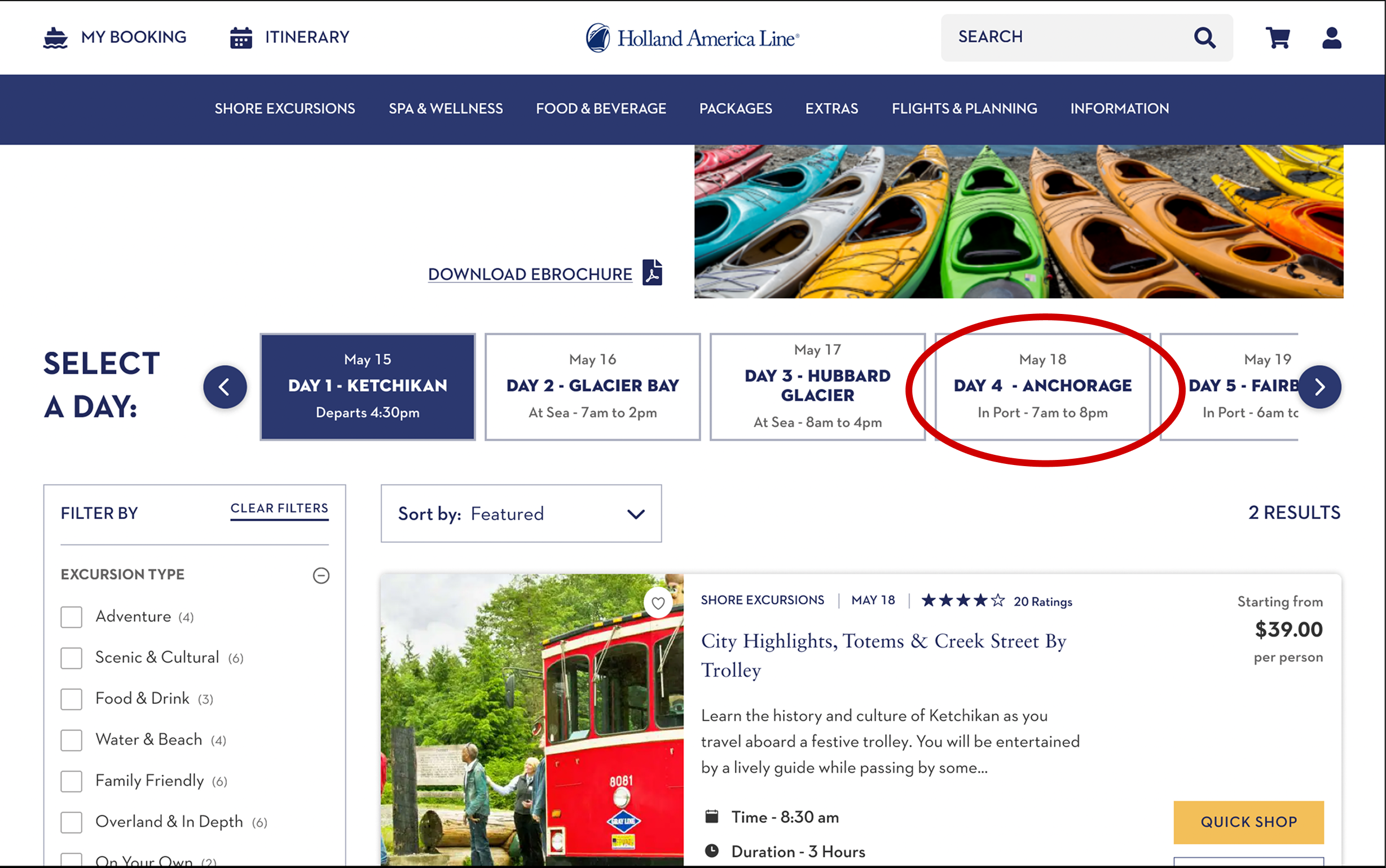
Imagine you have booked a cruise with Holland America Line and you would like to search for
activities on shore. Using this prototype, how would you go about finding port activities?
How would you find port activities for a specific day?
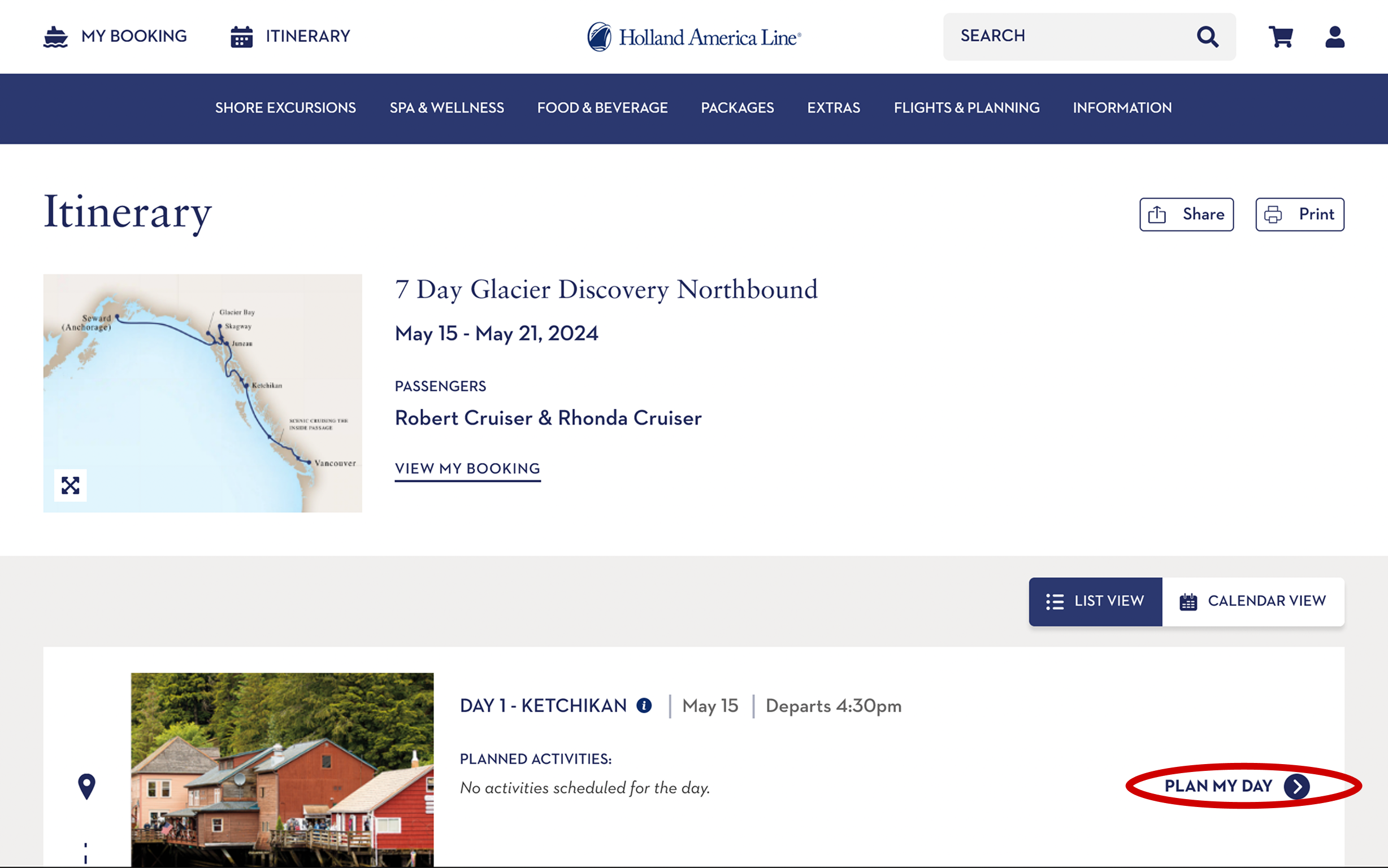
Highlighted in the image, you will see three different references to the Shore Excursions page, and a link the the Itinerary, where you can also look up Shore Excursions by the specific day and port.
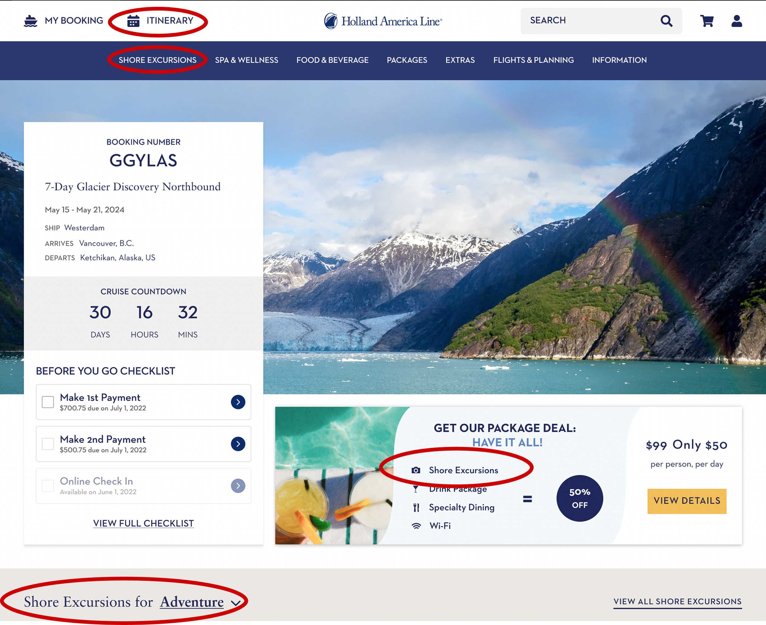
In the itinerary, you have the option to plan out your day (which did get utilized by at least one of the users during the test) that will take you to available Shore Excursions.
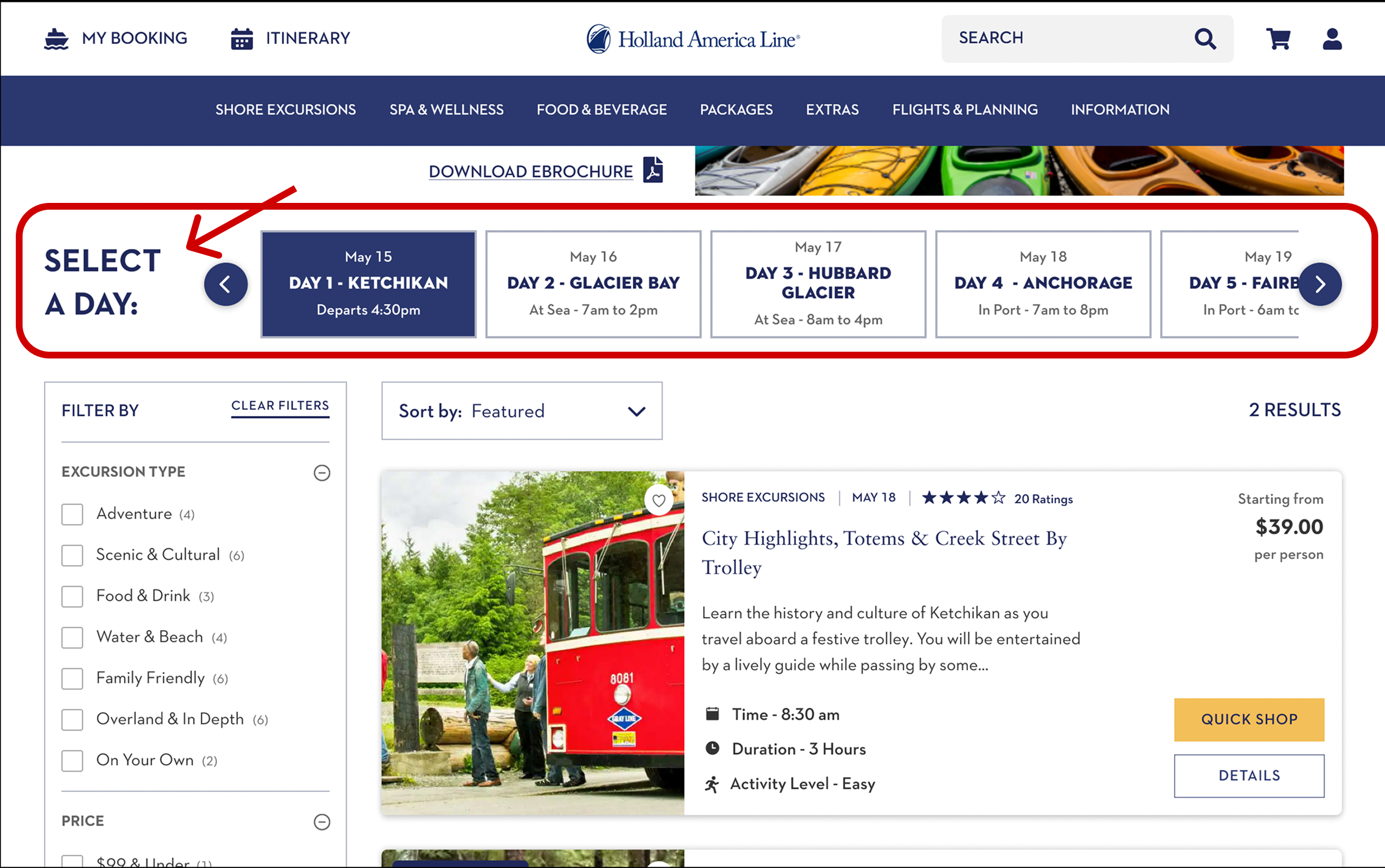
In the Shore Excursions tab, the carousel allows users to view available excursions based on the port that they’ll be in. Another alternative is to use the itinerary and look up activities by day there.
During testing, some of the users didn’t recognize this element as a navigational element, so ‘select a day’ was added to make this easier for users to find.
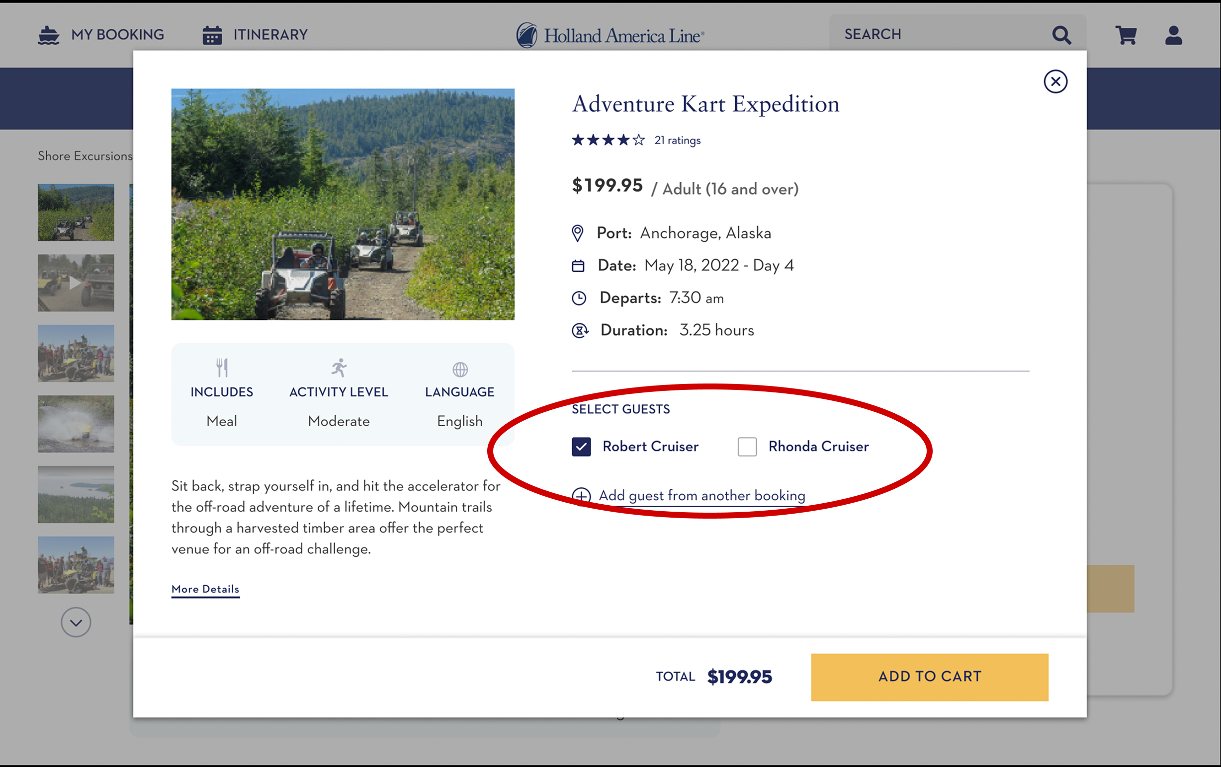
Task 2
Prompts:
Imagine you would like to find excursions for Anchorage on May 18th. How would you find
excursions for Anchorage on May 18th?
If you were not ready to purchase, how would you save a shore excursion?
Most of the participants were able to find the 18th with the date rotator, and as mentioned in a previous slide, ‘select a day’ was placed in an obvious spot to help users find this navigation tool.
The favorites task returned polarizing results. Two of the six participants actually used the provided heart icon on the picture, and the others seemed to want to add it to the cart and continue shopping (which was also optimized to save their items for later for this specific reason).
Task 3
Prompts:
Imagine you want to purchase one of these shore excursions. How would you complete a
purchase for Adventure Kart Expedition in Anchorage?
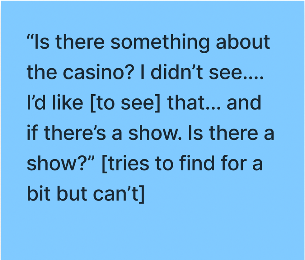
How does this compare to other experiences with online purchasing?
There was a trend here of participants not adding their partner/SO (though one participant did mention that they want to).
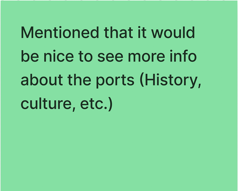
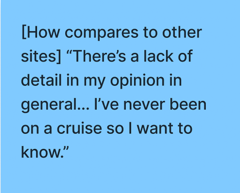
The prototype was rated above average by most of the participants. There were a couple of participants that mentioned that they would have liked to see more information.
Task 4
Prompts:
If you wanted to see where your past purchases would be, where would you go?
If you wanted to see where a specific item was for a specific day, where would you go?
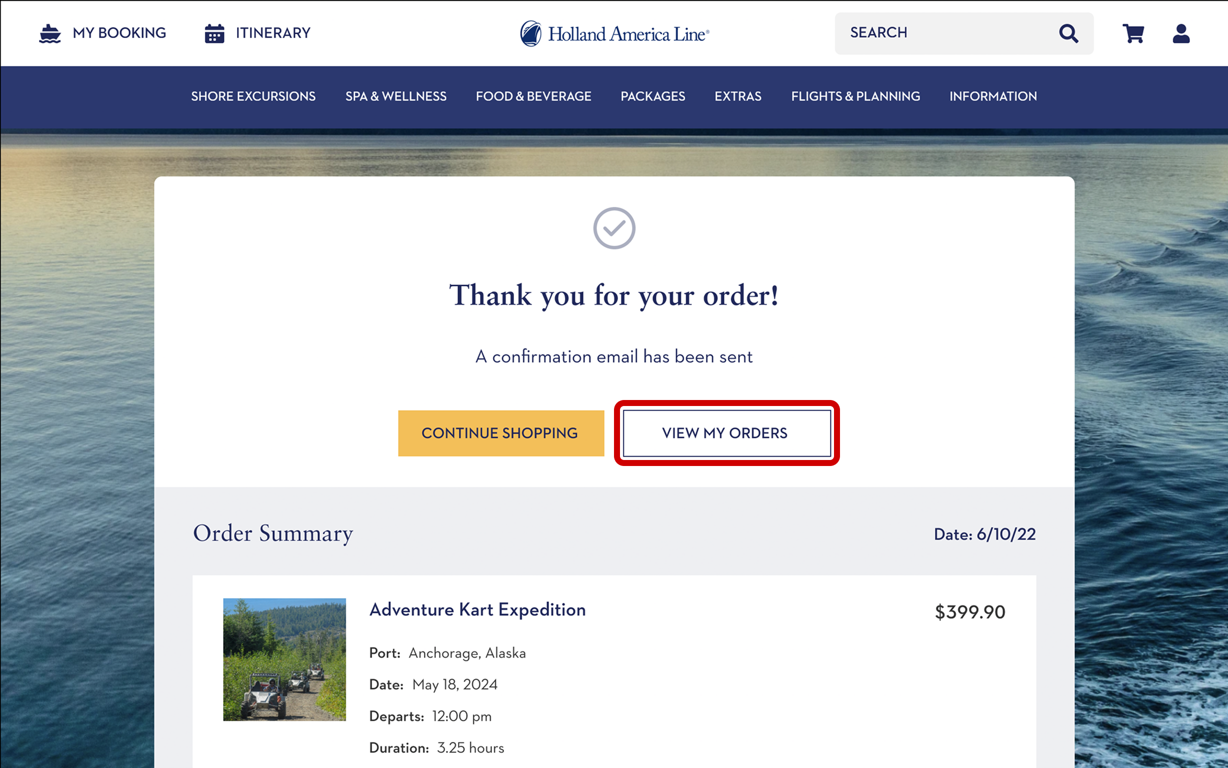
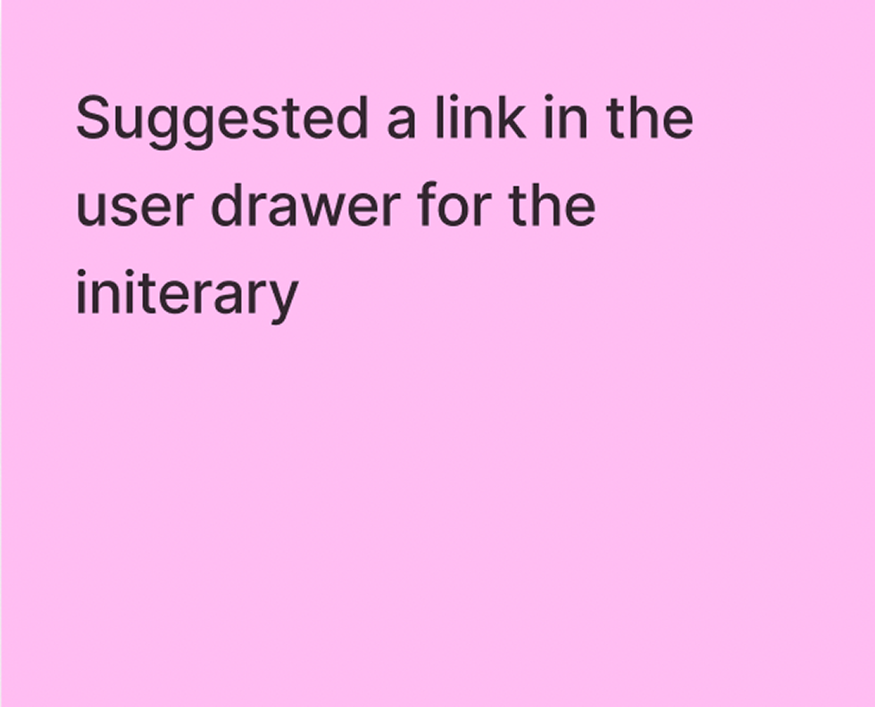
The ‘view my orders’ button was very easy for everyone to find on the order confirmation page, however several of the participants never opened the user drawer to look for order history when prompted.
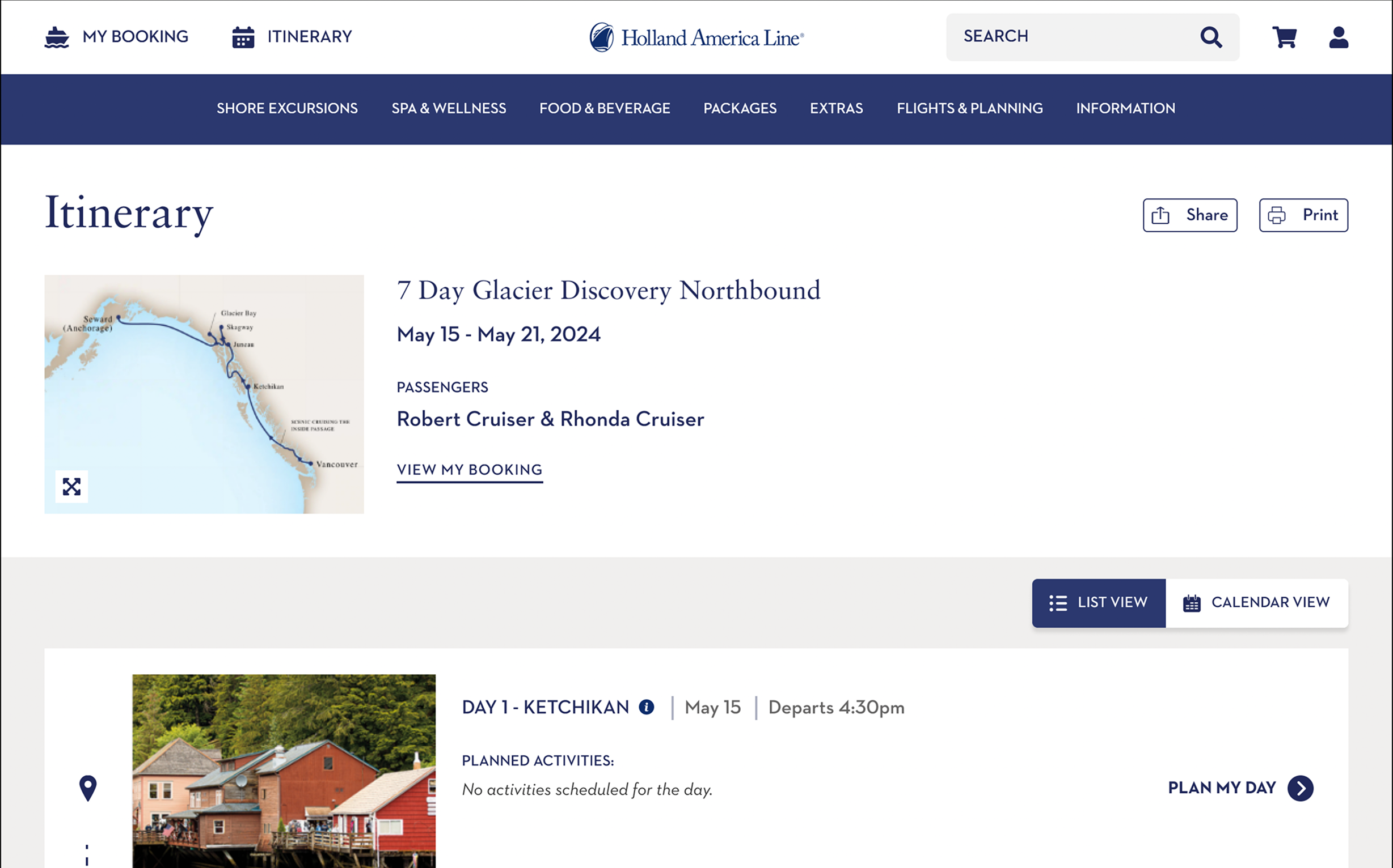
About half of the participants didn’t initially find the itinerary. There seemed to be some confusion around this section.
Thoughts worth considering

Recommendations
Pop-up help modals
When you first get into the flow, a modal would pop up and alert the user on how to navigate around the site. This would alleviate the issues of users not being able to find things such as the user drawer.
Pop-up to confirm guests
Adding another pop-up before checkout on items that can include multiple guests could help to make sure that guests don’t forget to book their friends/family.
Adding scrolls to any scrollable element
There were a few instances where users were unaware that the page scrolled down. Adding scroll bars alerts the user that they need to scroll down to see all the content.
UI Redesign
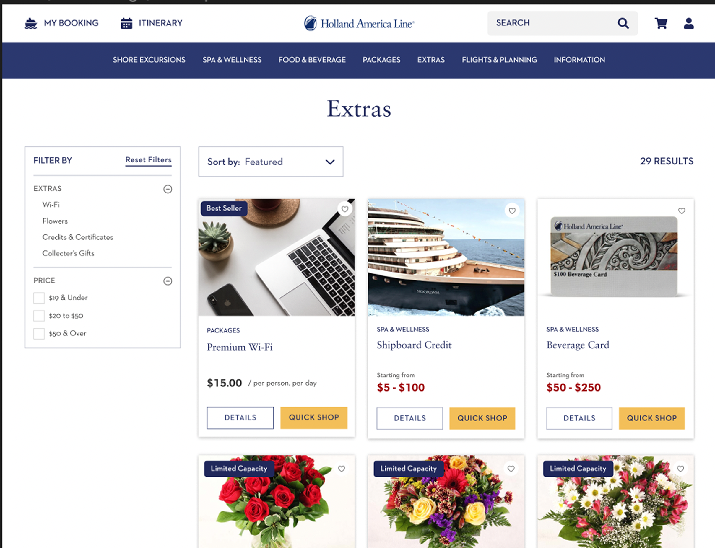
Old Extras Page
New Extras Page
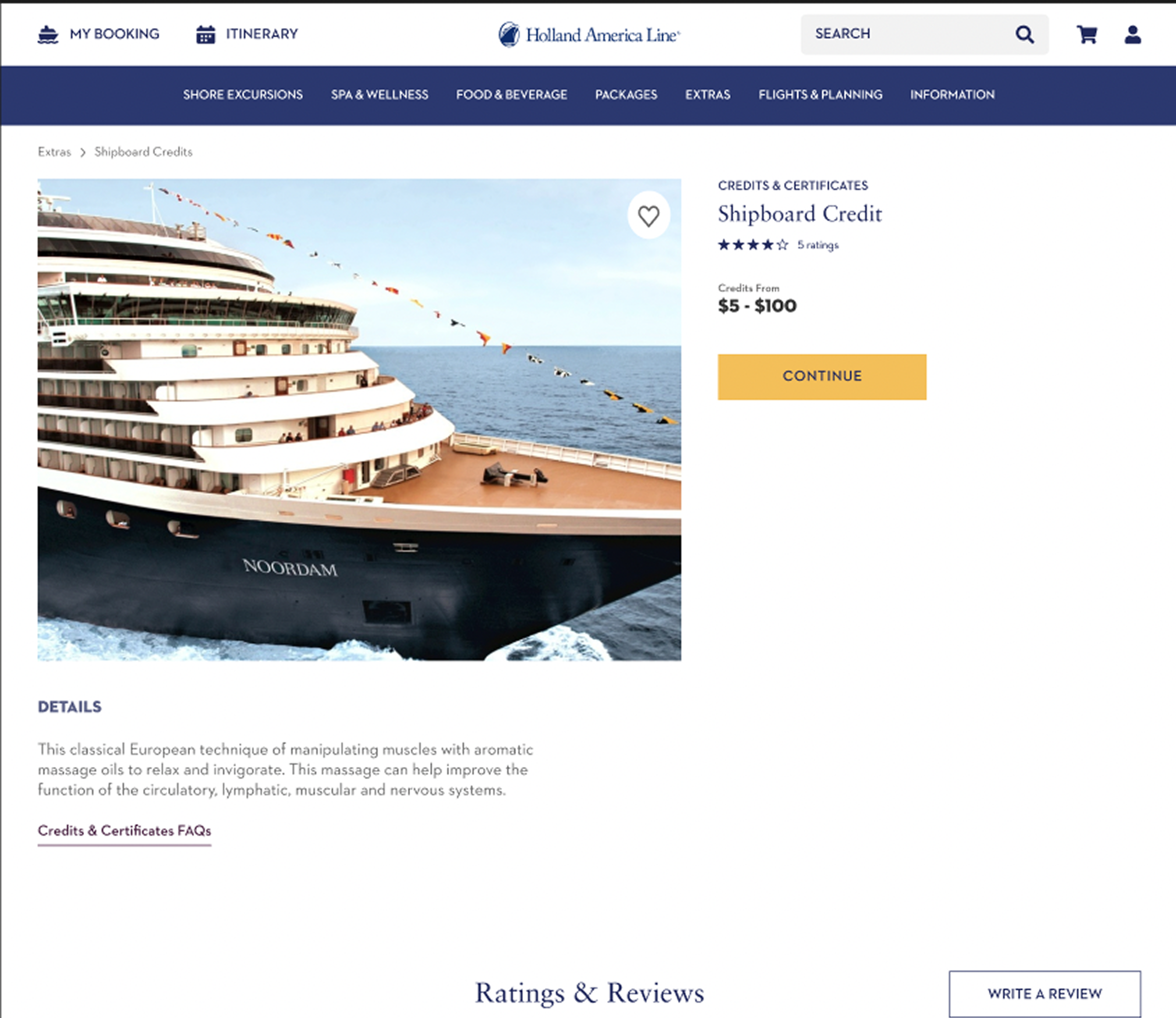
Old Details Page
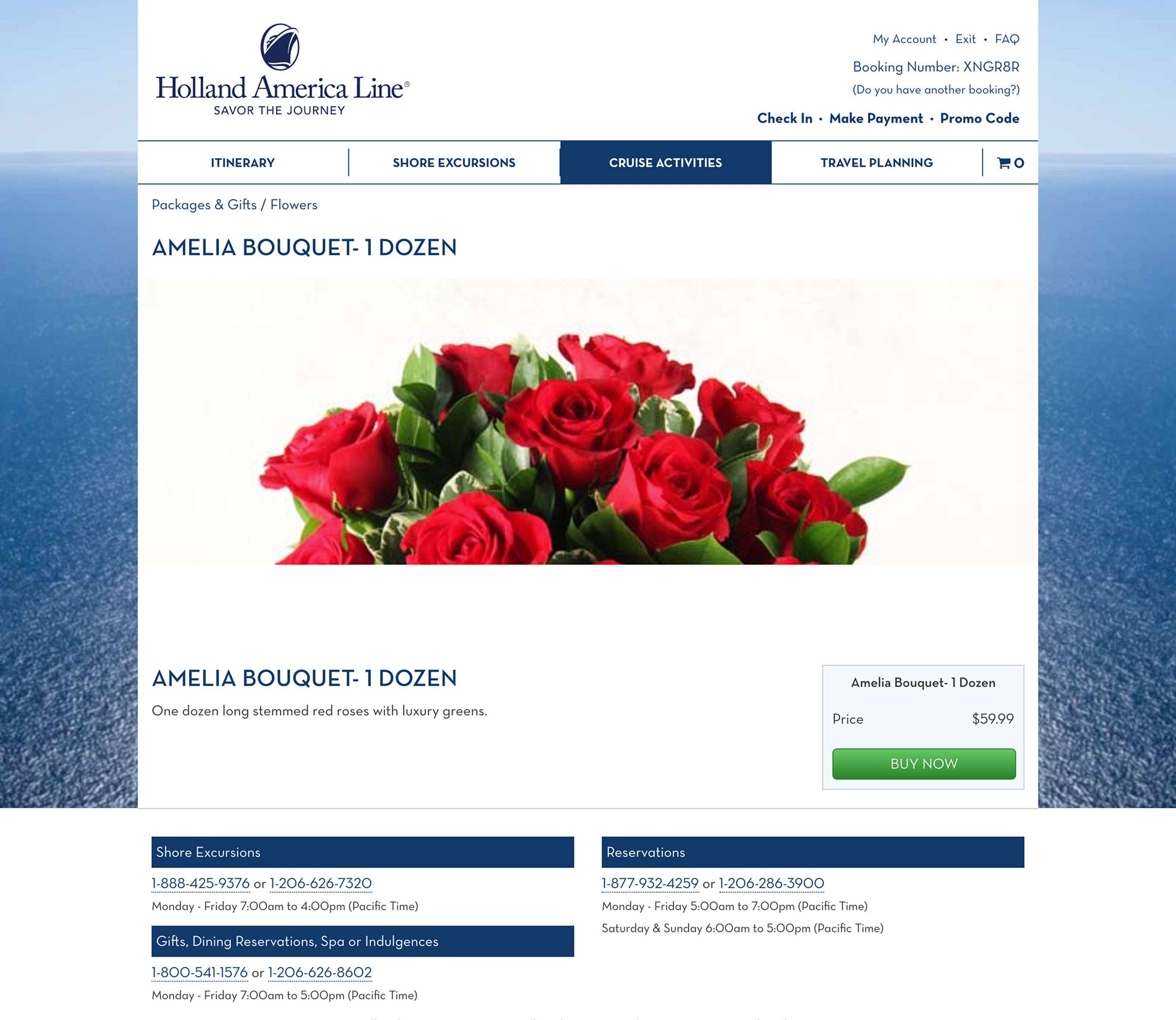
New Details Page
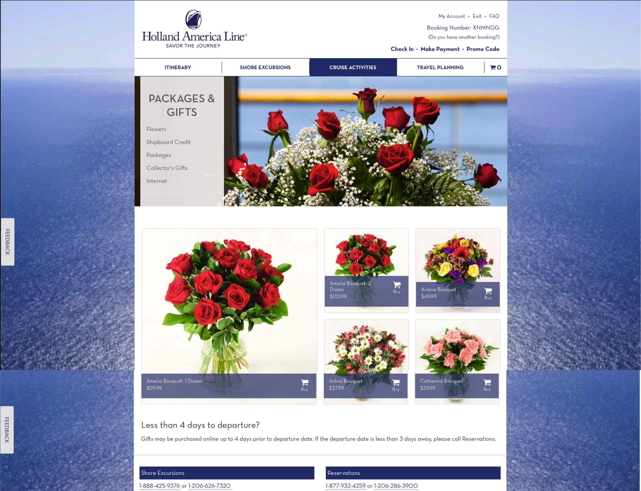
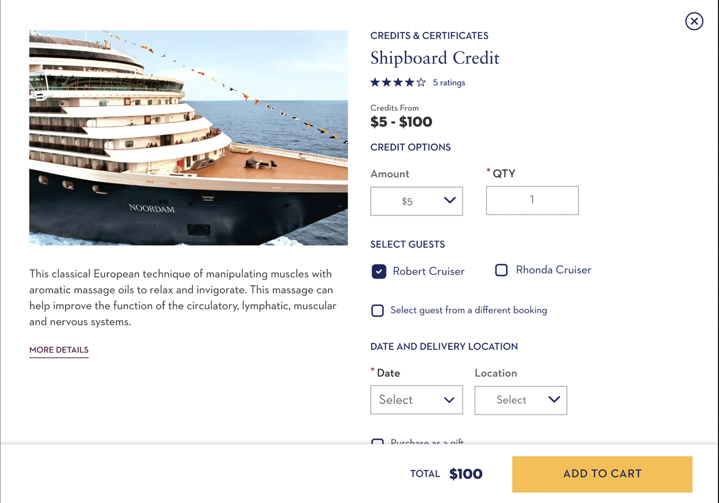
Old Gifts Page
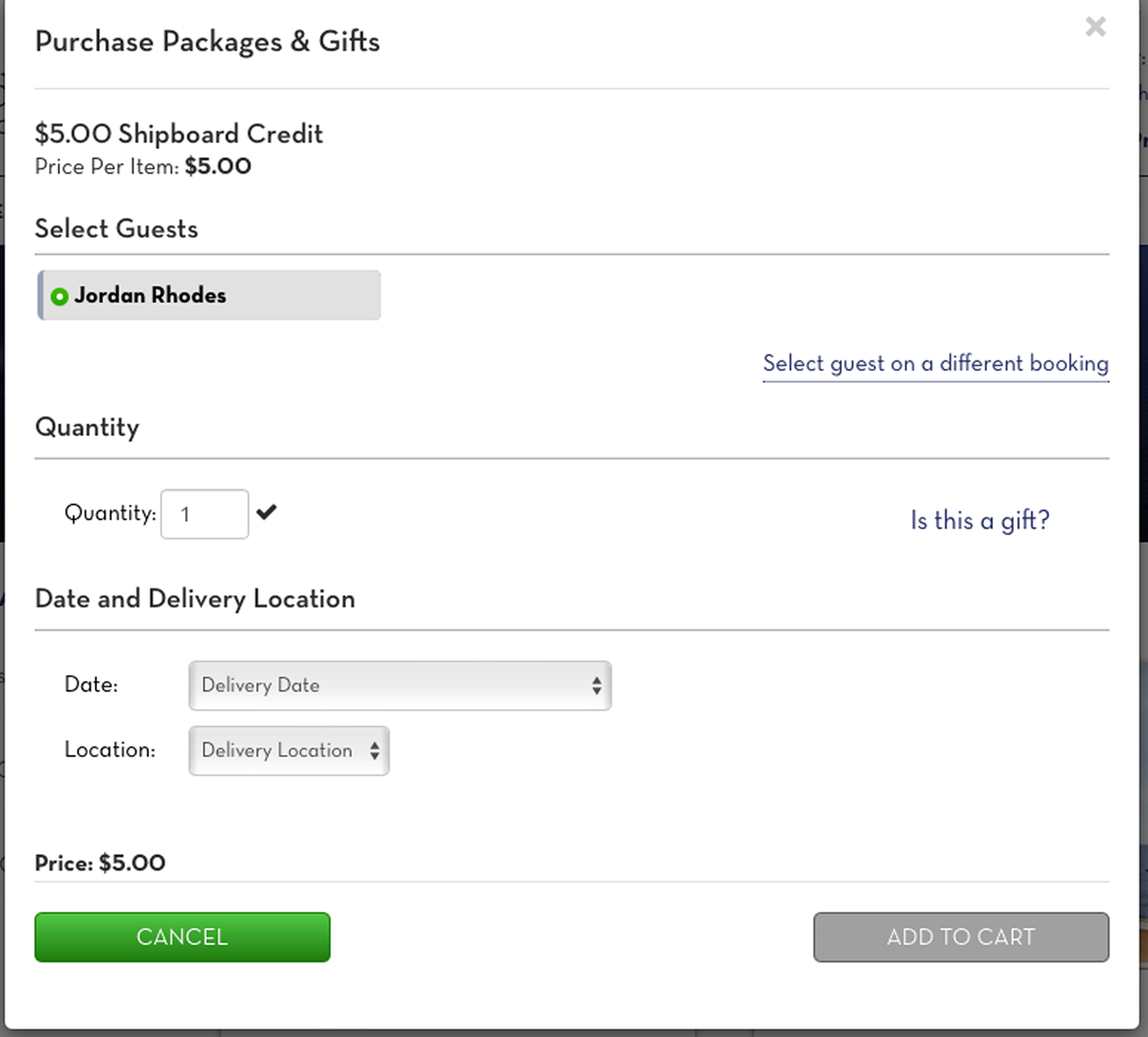
New Gifts Page
Mockups ready for dev
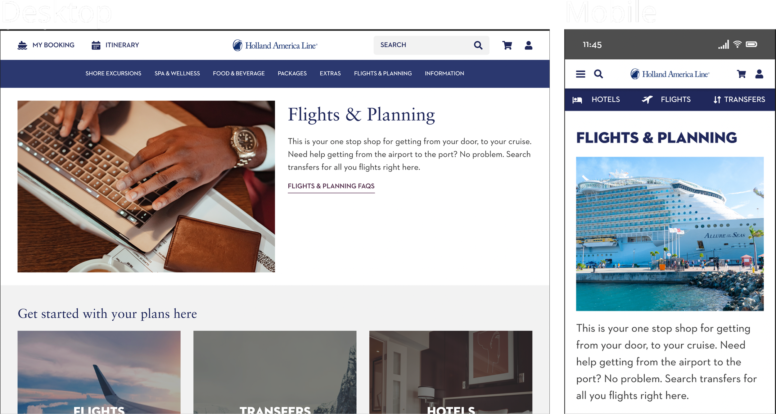
Flights and Planning Page
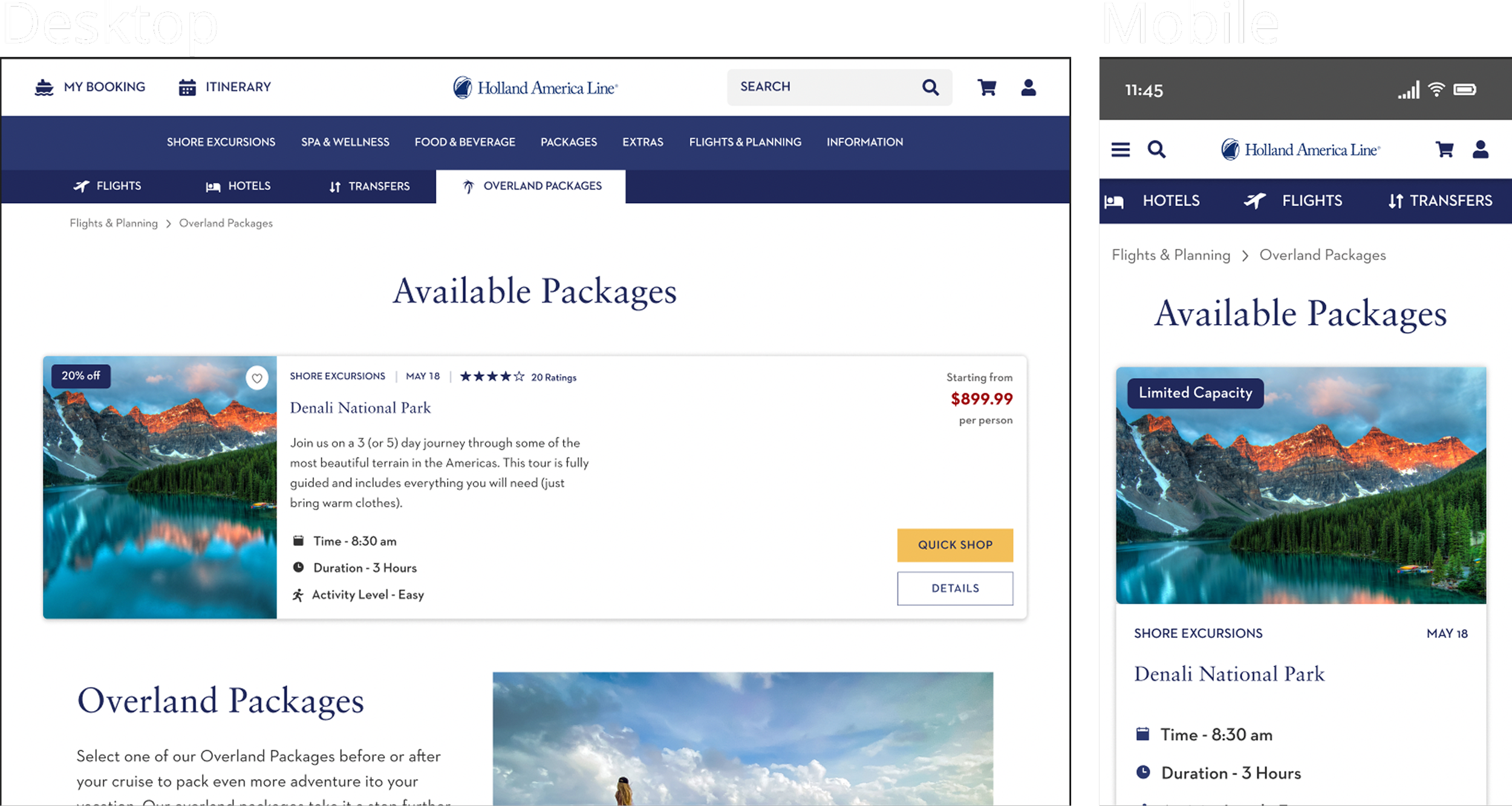
Overland Packages Page
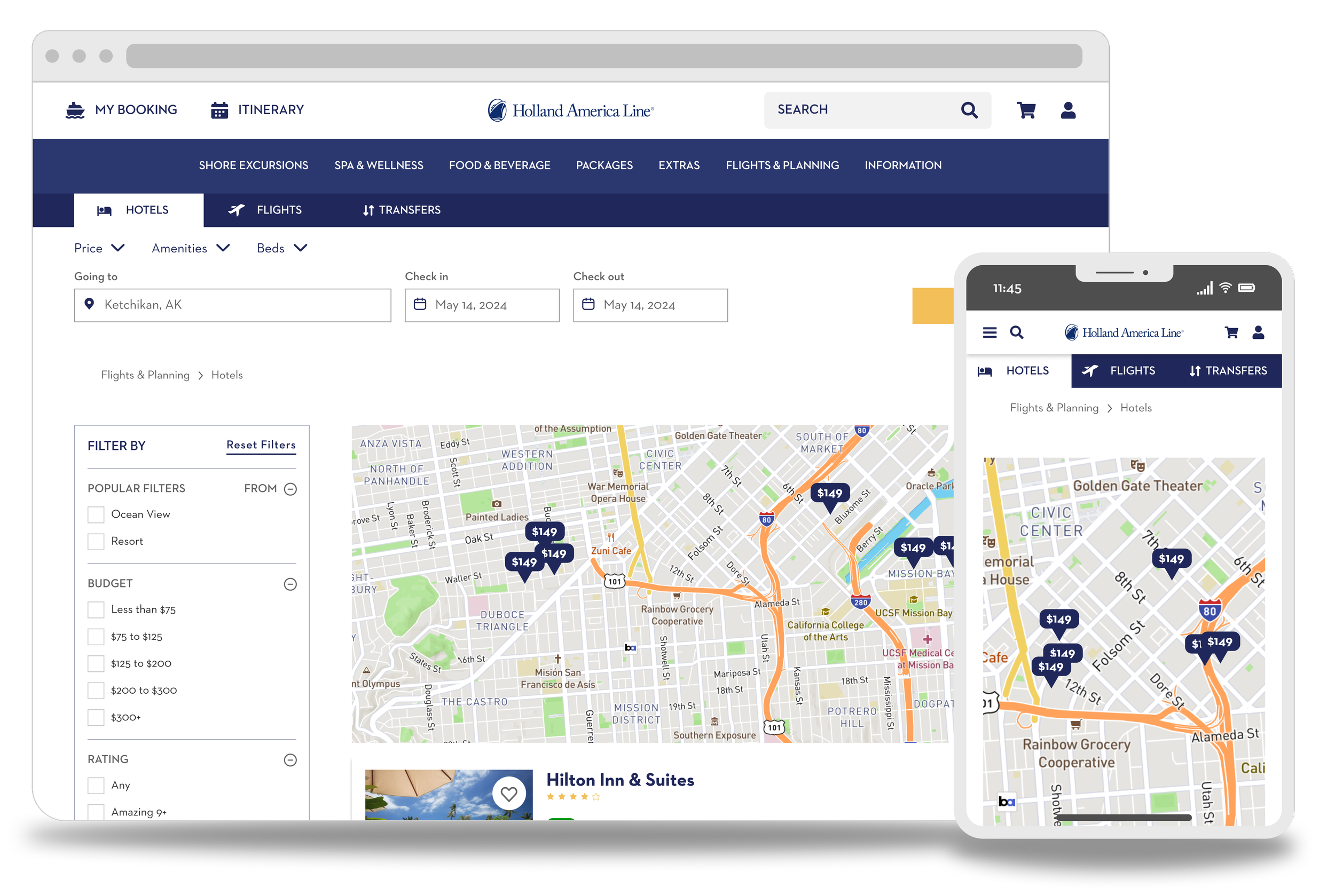
Hotel Search Page
Summary
What I learned
One of the biggest challenges for me in this project was setting up the primary navigation menu prototype. The interconnectivity with these menus was the largest menu prototype I’ve made at that time. There where a few times when there wasn’t a straightforward answer in the design (a specific example of this was complex object positionings within auto layout).
I also had the chance to work around some new technologies. UserZoom was a service that I’ve never used before, and I found it incredibly helpful and very insightful.
This was an incredible opportunity for me to grow as a designer. The team at Holland America Line was very friendly and a pleasure to work with.
If you wanted to see where a specific item was for a specific day, where would you go?