ClarityNOW
2022 | UX Designer | Contract | Design Sprint
Project Objective
I was approached by the VP of marketing for ClarityNOW about assessing the state of their CRM’s onboarding experience. During initial discussion, several inquiries where made about the ease of the current user flow and the format of the UI itself.
ClarityNOW users need to be able to navigate through a succinct onboarding flow, while still providing the information necessary to make use of the features.
My Role
Product Designer
UX Researcher
Observations During Discovery
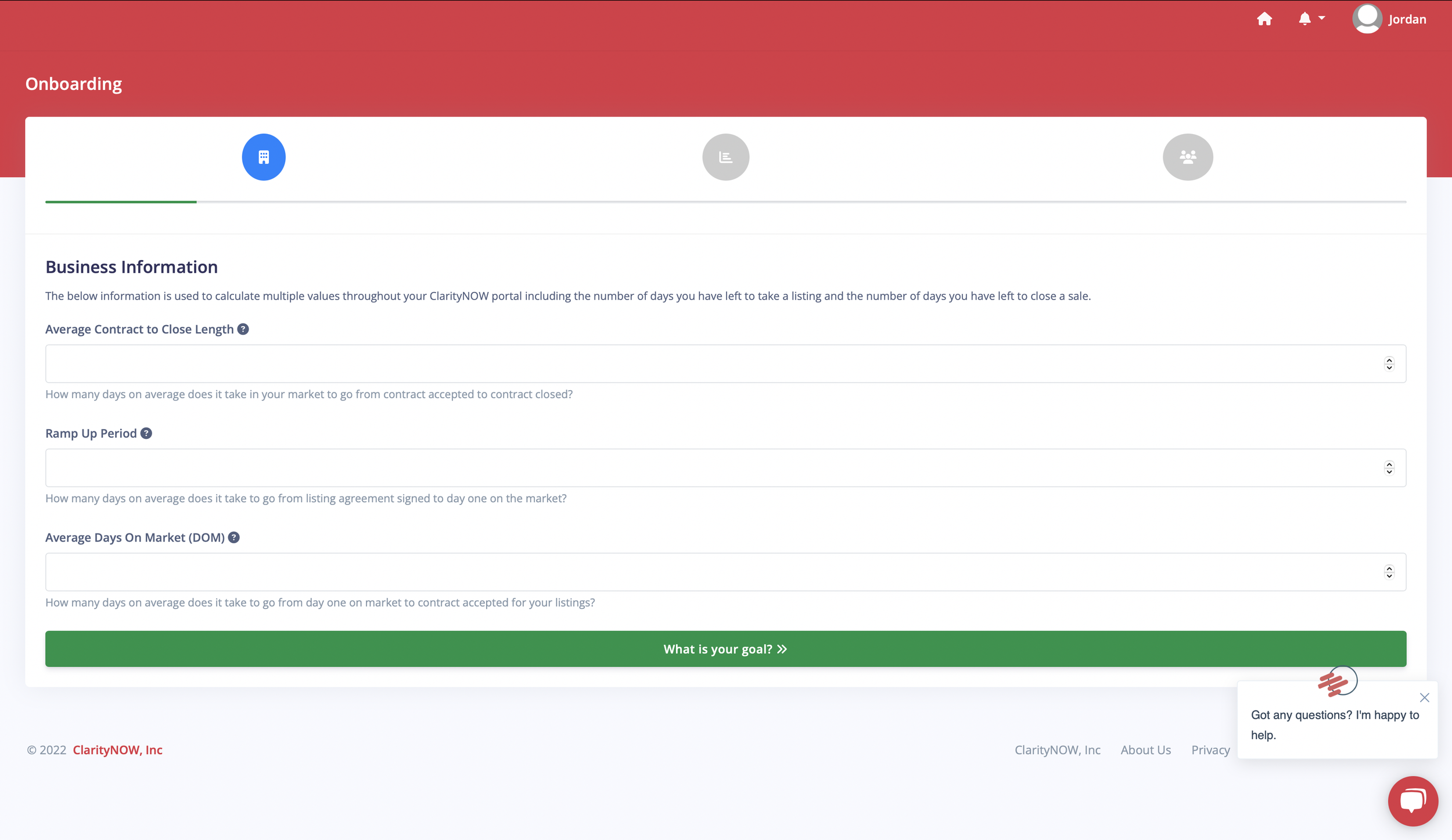
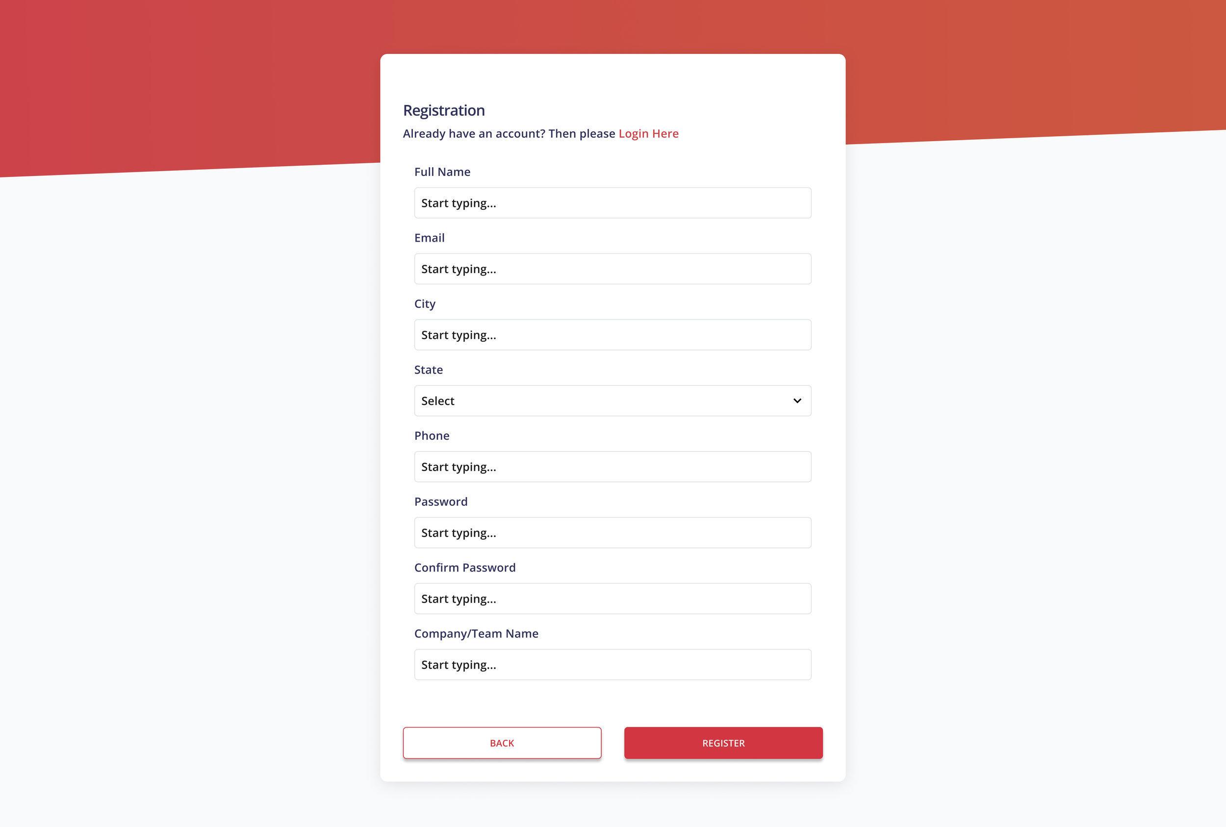
There were multiple issues with the UI that were either contradicting basic design principles or WCAG guidelines. The input boxes would take up the whole screen with no apparent break point. Additionally, irrelevant input methods were present in almost all of the input boxes.
There were many instances of low contrast in the onboarding flow.
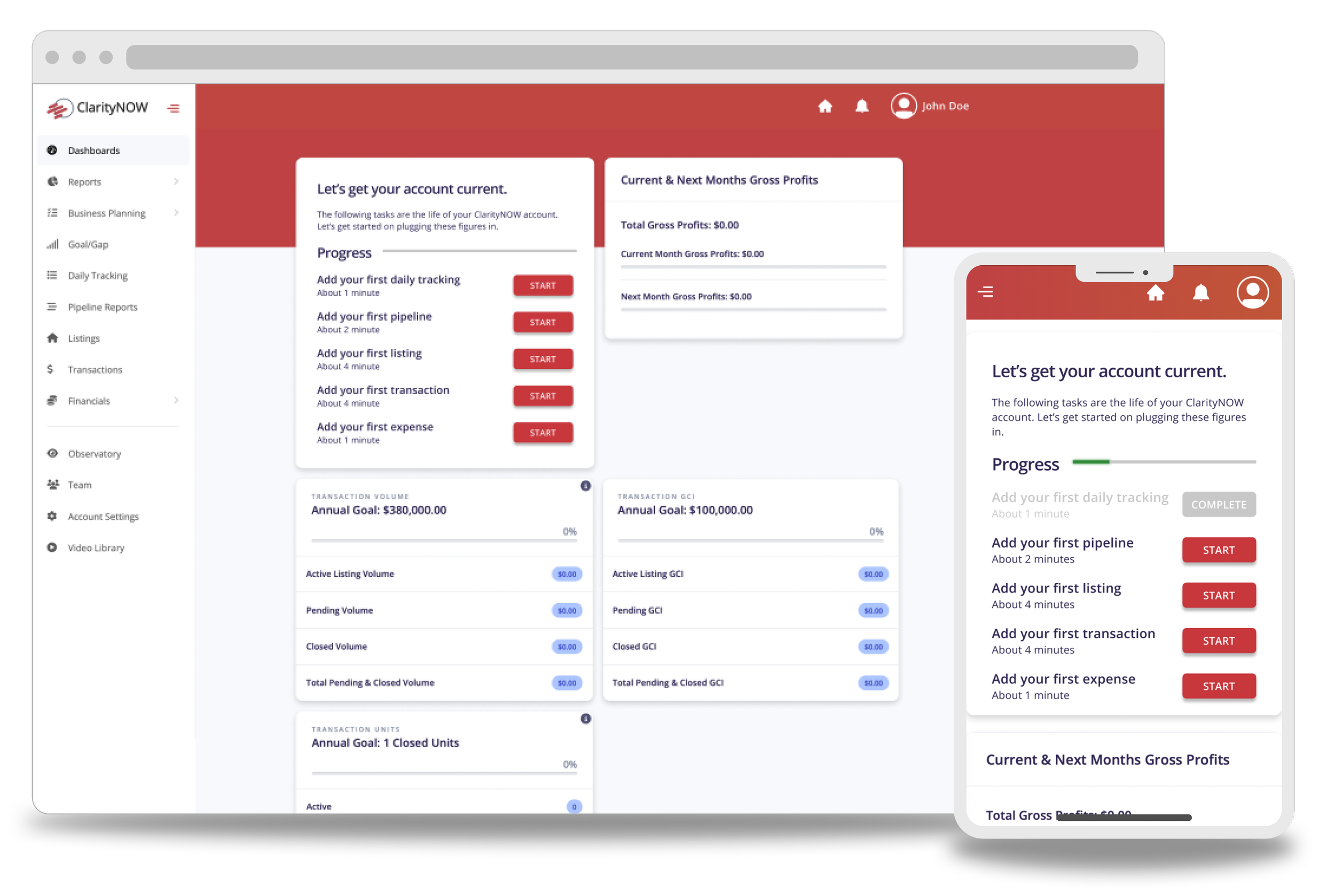
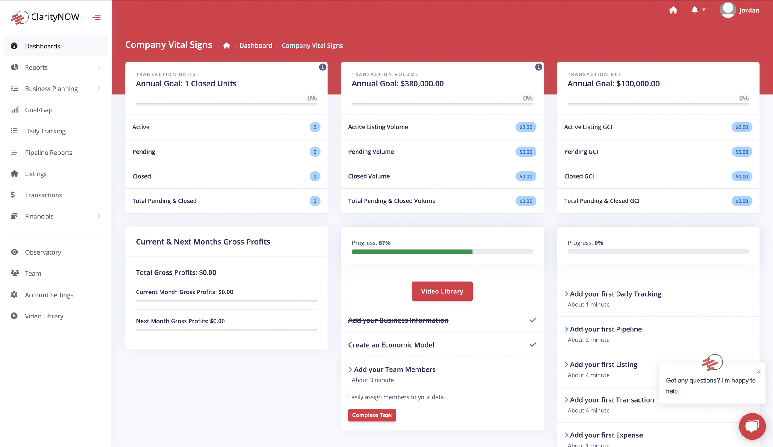
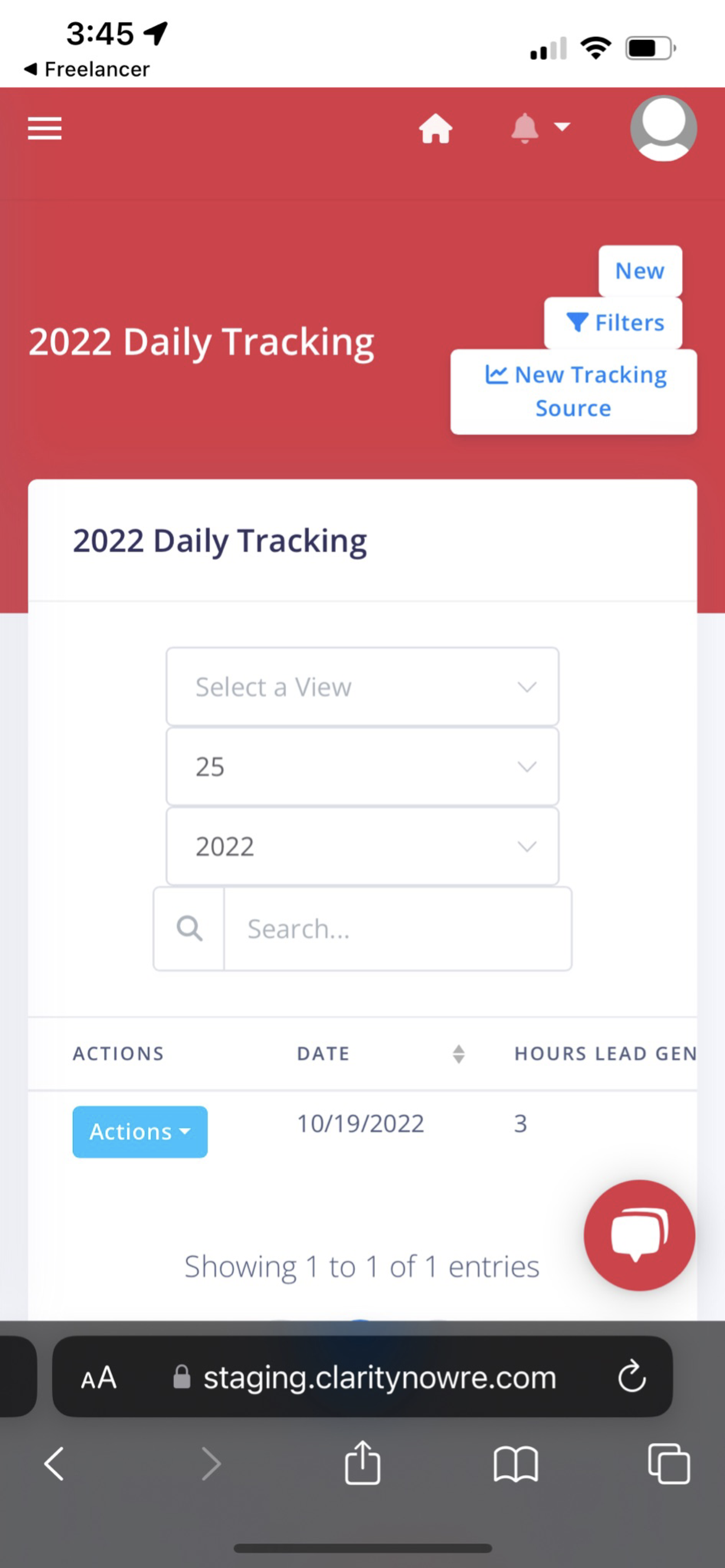
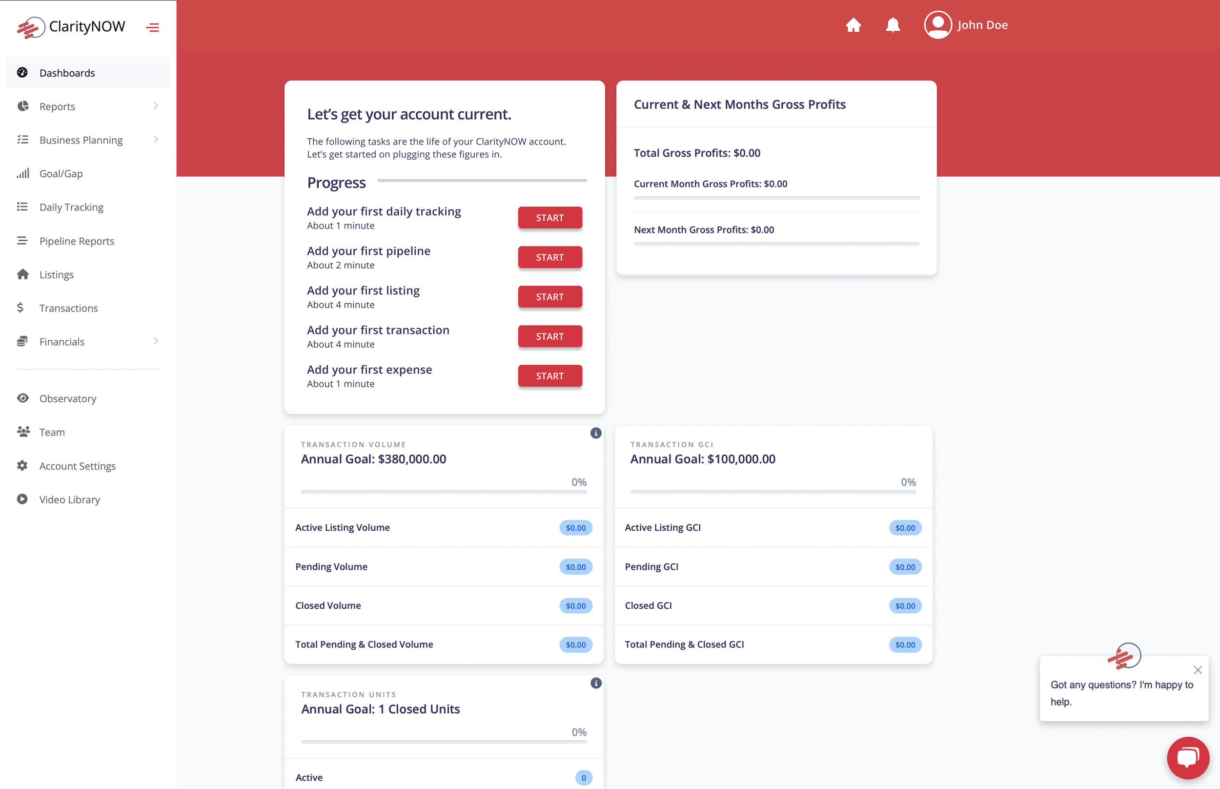
Findings on the Dashboard
One of the bigger issues found with the dashboard was the priority of the information displayed. After the initial onboarding process, you arrive at the dashboard. One of the issues brought up by the VP was the fact that people were failing to complete tutorials for the specific tools once they arrived at this screen.
Information should be arranged by priority, stressing the importance of completing the tutorial so clients get the most out of the platform.
This page also suffered from multiple instances of contrast issues.
On all of the sub-pages, the call-to-action (CTA) buttons were far from obvious (the CTA is in the top right portion of the screen; a white button).
Mobile View
The mobile view of the site was not at all optimized. Buttons were crammed to the point that you could barely tell them apart from each other. The overall form was even more difficult to use than the web view. The issues with padding, margin, and consistency appeared to be even worse here.
Redesign
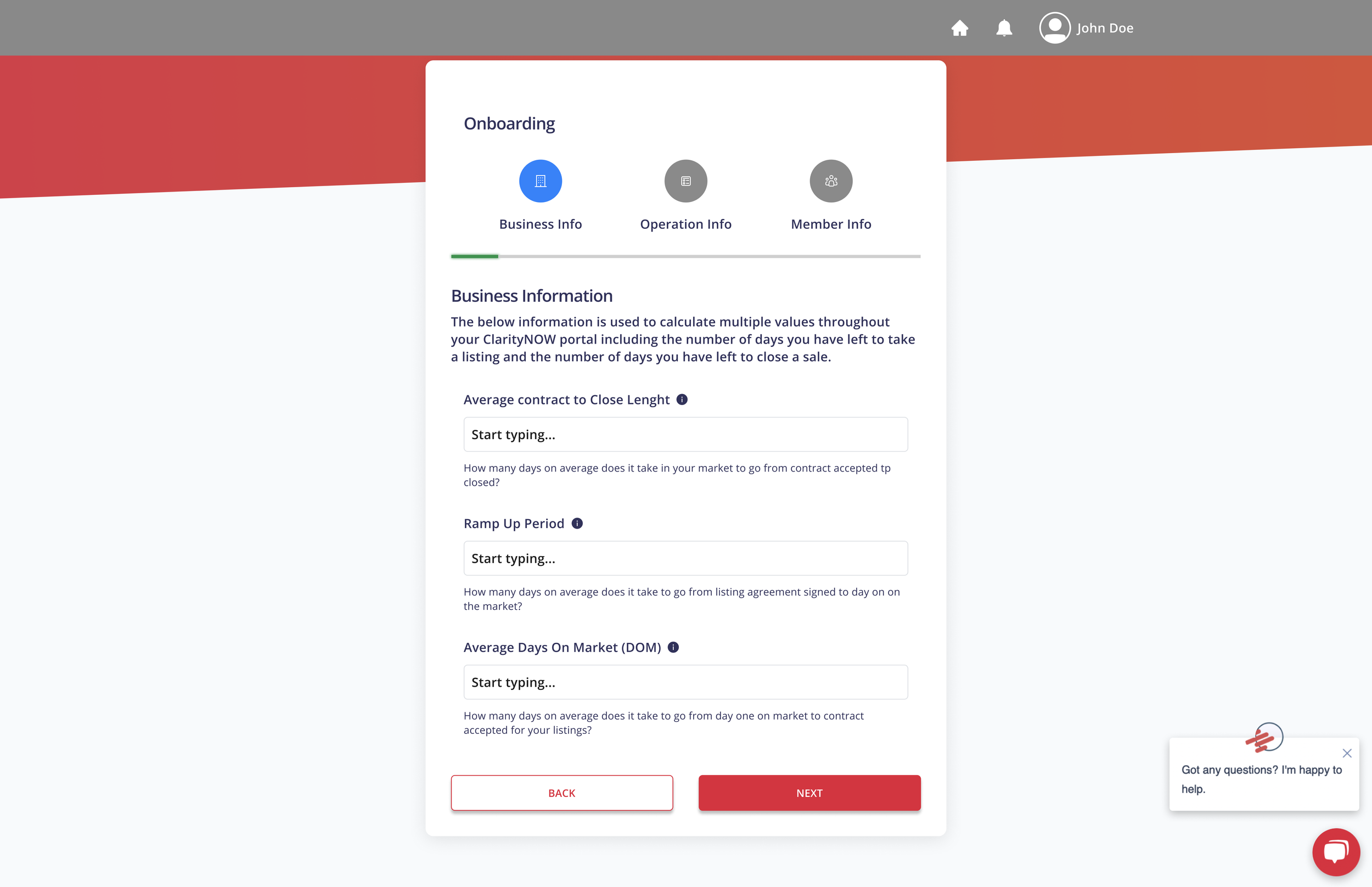
Based on the findings from the discovery week, the onboarding pages were redesigned to meet WCAG criteria. The size of the container was reduced significantly, making it easier to focus on the tasks at hand without having to look across the whole page for every line.
Note: The design for this project was limited to the capability of the CMS the client was using, so the designs for the containers, modals, and other various UI elements were carried over from the first design.
Onboarding Flow
Contrast issues were fixed
Progress icons at the top were labeled to provide more info about the users whereabouts in the process.
Unnecessary input toggles were removed.
While design was limited by the platform the client was using, rearranging certain elements and ordering them by priority made it easier to navigate.
The onboarding tasks were moved to the first spot, highlighting their importance. CTA buttons were placed next to each one of the tasks to further encourage users to complete these important steps.
Calls to action (CTA’s) were moved to a very obvious place within the sub-pages on the dashboard. An additional CTA was placed in the center of empty pages to nudge users to get started.
User testing overview
After reworking the design, we wanted to test how real users responded to the redesign.
We interviewed 5 active Real Estate professionals working in an administrative capacity.
Our goal was to answer these questions:
Can participants successfully navigate initial onboarding procedures and complete the remaining steps after reaching the dashboard?
Is there anything missing from the design? Is there anything that looks out of place?
How long does it take for the average person to complete these tasks?
We conducted moderated usability studies and collected a systems usability survey from 6 participants.
Analysis & Synthesis
The test was passed by all participants, and the system usability survey passed at a 81% success rate (65% being the minimum passable score).
A Gap in the Market
A potential market gap was uncovered when 3 of the 5 individuals voiced they wanted to see more functionality with the expense reporting.
"This one, the monthly expenses I found... That one surprised me because if it's just a rough number, then I'm sure someone could just throw a number down there, right? But there's a lot that goes into monthly expenses, so it's pretty complicated to get that accurate i'd Say."
- Participant
"For me, I don't see the benefit to it with what I have in command (KW CRM) unless it was linked with command. Command has designs, it has ad campaigns, it's souped up. It's a one stop shop for everything that we do. The only exception to that is really the expense side of things. The goal setting and the GCI calculation, all that stuff is done within command. For the solo individual it is pretty simple to do, with teams. Which I think this is geared towards primarily, it is very cumbersome compared to what you have".
- Participant
Reflection
This project gave me some insight into the industry of real-estate. I had the privilege of working with some very creative individuals who were passionate about their craft.
This was one of a few projects I’ve worked on where I was using a very limited pool of design assets. I learned that design isn’t always recreating every little detail. Sometimes things need to be optimized using a pre-existing arsenal. This forced me to hyper-focus on the user flows. I’m grateful to have been given this challenge.